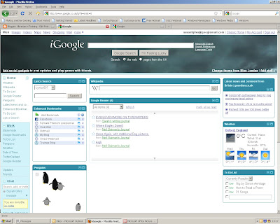
As I mentioned, briefly, in my first post, my 23 Things is already worth it, purely because of my iGoogle page.
Because I am never one to do things by halves, I have set up two tabs in my page - one for work and one for home (the one pictured is my home tab, because that's the one I've set a background for). The main difference on them is what's featured in the bookmark gadgets and the to do lists.
My favourite gadget so far, I must admit, serves no purpose other than making me childishly happy - there's something mesmerising about watching the penguins chasing the mouse - but this is because inside I am still six.
The most useful gadets are the links boxes. In order to find out which is best I have enchanced bookmarks on my home-tab and the offical google bookmarks on my work tab. So far, both are pretty even on the pros and cons: 'enhanced' has some nifty icons but not all of them work and has an immediate option to open in a new tab, 'google bookmarks' is a more basic list which actually looks more tidy without the 'default' icons of enhanced, but has to be right-clicked and selected to open in a new tab, which is something I always forget to do.
I don't want to talk about googlereader now, incase it leaves me with nothing for next week, and the to-do lists are pretty obvious. On my home tab, I've modified one to be my reading list, with an option for 'To Read' and another for 'Currently Reading'. If I manage to keep on top of that it will make yearly round-ups alot easier.
Really like the way you have used tabs. Also really like the fact that you post in detail :)
ReplyDelete